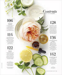
 This table of contents page was chosen because I feel it is a perfect fit for the vision I was going for. What I like most about this TOC is how it matches my cover in which the main picture is the center of attention and the phrases and content is on the sides. Both this image and my cover page would compliment each other very well. I also like how the numbers are much bigger than the text because I have a big number on the cover of my magazine that would fit this format. This is so far in the lead for how I create my TOC compared to the other contenders. 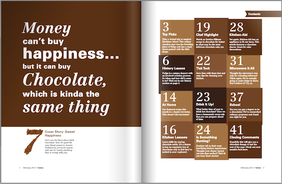 This TOC inspired me when I first saw it and I really love how unique it is. The actual contents part seems really fun and different and it keeps the readers interested. I like how on the left there is a cute saying that also matches the theme of the magazine to let viewers further see what the main topic is. I could definitely add my magazine's catch phrase to that section or even another type of saying that could be one of my trademarks. Another thing I liked about this TOC is that just like the other TOC contender inspirations, the numbers are much bigger than the text which matches my magazine cover's format. 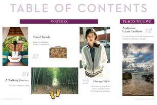 I chose this TOC as a possible option for the layout of mine because I really like how there are little previews next to the topics. The pictures show a sneak peak at what the topic will be discussing and this would definitely fit into my TOC because I could add images of the food I will be talking about on that page. I feel like that would make my magazine even more enjoyable and keeping readers intrigued because they will get a sort of inside look on what they could be learning about. Possible article topics:
0 Comments
Fargo Notes Comparison:  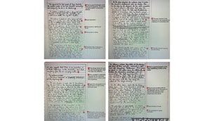 Notes Comparison: Similarities: Both my notes and the notes from Cambridge have some specific information on certain scenes. We both elaborated on why something is happening and what it could possibly mean. We had some pretty similar tactics when it came to the order in which the scenes were occurring. For example, they were able to put the notes in order of when it happened, which is exactly what I did too. This helps make the information much less confusing. Differences: One major difference I could find between the two notes is mine is not nearly as organized as the Cambridge one. I just wrote information as the scene was going instead of putting into categories. The Cambridge one was able to make it so people can distinguish between what they were trying to explain, while mine is hard to tell what I am truly talking about when it comes to the camera, miseducating-en-scene, sound, and editing. Although I also included some additional information beyond these topics, the Cambridge one added much more and made it more clear. It would be easier to understand what scene they were talking about compared to mine which is a bit sloppier. Fargo Responses Comparison: 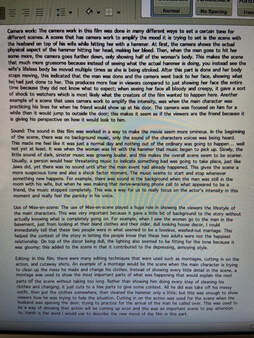  Response Comparison:
Similarities: There are actually many similarities in both mine and the Cambridge responses. We both included a ton of information that expands exactly what we put down for our notes. We were very specific on each scene that we were describing in regards to the camera work, mise-en-scene, editing, and sound. I feel that they were both very easy to follow and in the right chronological order. We both described everything well and I feel they were both overall very good. Also, the organization was very clean and precise; it was extremely uncomplicated and very comprehendible to anyone. Even if they have not watched the film they could still be able to understand our responses. Differences: I was not able to find many differences in these two responses. They were both pretty similar in how specific they were and how organized it was. Maybe the only difference could be I was able to add more examples that further made my claims understandable and easier to follow. 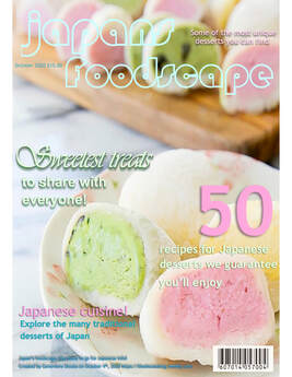 Title/masthead: The title of my magazine implies that it will be talking about different types of Japanese desserts. It will go into detail on where traditional sweets originated from and how to make it yourself. I put “50” in a big font to let people know that there will be a lot of recipes to choose from; so, it is almost guaranteed that they will like some desserts shown in the magazine.
Typography: The shape, color, and design all have an effect on the overall modd and tone which is fun and colorful. By adding many pastels and different fonts, I made it look very happy and cheerful to show potential buyers that this is meant to be an enjoyable and entertaining magazine. Image: The main image is a picture of a plate of a certain type of well-known Japanese dessert known as mochi. It is angled in a way to show how this dessert would look on a plate in a house. This is meant to make it seem much less intimidating compared to looking at a more complicated dessert. In a way, it looks welcoming, as if it is telling the readers, “You can easily make this dessert in your own home for everyone to enjoy!” Language: The strapline or slogan of my magazine is “Japan’s Foodscape, the place to go for Japanese info!” I chose this because it was easy to remember due to the rhyming of it and it is also a way to let everyone know that this magazine covers Japanese information on not just food but the tradition and culture behind it. The most noticable linguistic features would be the main title “Japan’s foolscape’ and the middle text of “sweetest treats.” I purposely made the “sweetest treats” part in a more cursive and stand-out font to keep my theme going on letting the readers know what they would be seeing in this magazine. |
AuthorGenevieve Shoats: AICE Cambridge Media Studies student. Archives
April 2021
Categories |
 RSS Feed
