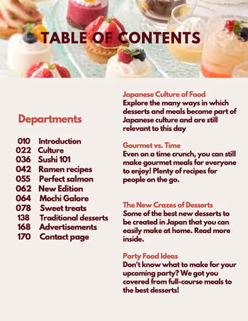
 Compared to my previous TOC, I changed something to make it more professional. Instead of all bright colored red fonts with barely any difference, I made my descriptions a darker font to not only make it look nicer but to have the audience be able to see it better. It makes a huge difference and I was still able to stay within the color pallet of my picture. For example, the dark red color I was referring to is actually in the color pallet of the picture up top when I logged it into Canva. This helped make my decision of keeping it easier because it all matches.
0 Comments
Leave a Reply. |
AuthorGenevieve Shoats: AICE Cambridge Media Studies student. Archives
April 2021
Categories |
 RSS Feed
